Avocado
A Fresh Identity for a Complex Service Model
Role
Brand Designer, Visual Designer, Web Designer
Deliverables
Brand Design, Visual Designs, Web Design
Avocado Communications supports brands entering the European market with compliance, logistics and marketing services. The company offered a strong set of solutions but the services appeared disconnected and the brand had no unified visual identity. The goal of the project was to create a clear and modern brand system and design a website that presents these services as one connected journey.
AI Summary
Get a quick overview of this project generated by AI.
The Challenge
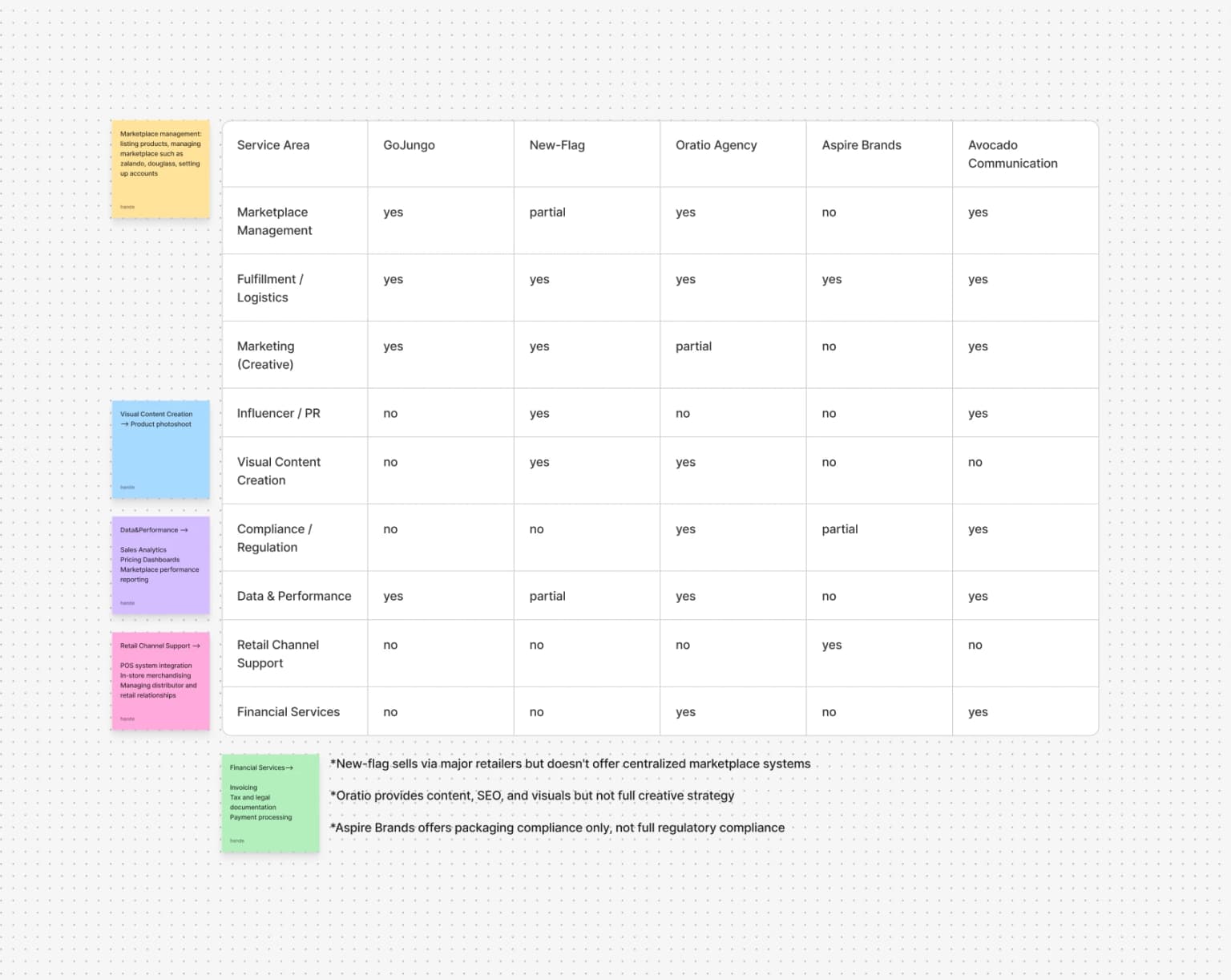
The biggest challenge came from the industry context. Many companies working in compliance and logistics have outdated websites, unclear messaging and heavy visual styles. Competitor analysis was difficult because most examples did not represent good design standards. Our aim was to create a site that looked professional but not boring. It needed to explain complex services in a simple way and stand out in a market where many brands still use old design patterns. This required a fresh visual approach and a content structure that communicated clarity and trust.
The Problem
- Each service had limited and scattered information
- The company provided an end to end solution but this was not visible on the website
- There was no consistent visual identity to support a modern and reliable brand image
- The content structure made it difficult for users to understand how the services were connected
- The value proposition was not easy to grasp, especially for compliance related topics
Insights
After analysing the market and reviewing the company's content two insights shaped the direction: The strength of Avocado Communications came from offering all services under one roof. The market lacked clear and modern communication, which created an opportunity to differentiate with a fresh and structured approach. The new concept focused on showing the services as connected steps in a single process.
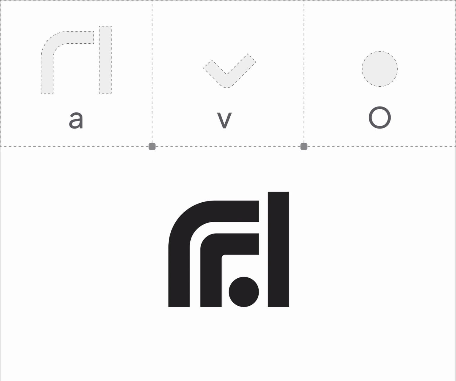
Logo Design
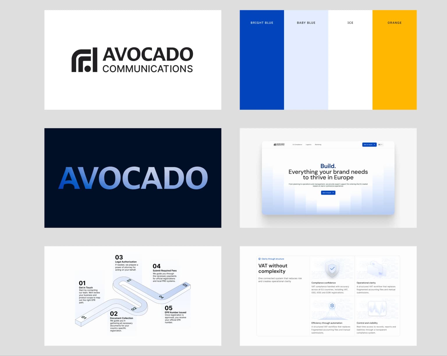
Creating a new logo was an essential part of building a modern identity. The previous version did not reflect the company's structured and solution oriented approach. The final logo uses geometric shapes to represent structure and precision, symbolises multiple services coming together into one complete solution, works effectively at different sizes due to its clean form, and adapts well to different backgrounds and color variations. This logo became the foundation for the entire visual identity.
Branding Direction
I designed two visual directions: A warm palette with green and beige; A cooler and more professional palette built on blue tones. The client selected the blue palette because it communicated clarity, trust and a modern tone. This palette, together with the new logo and illustration system, created a cohesive and structured visual identity.
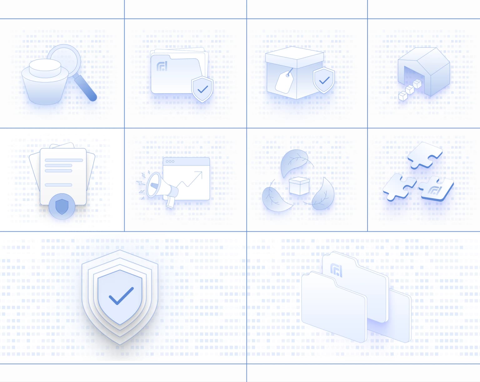
Visual Design and Illustration System
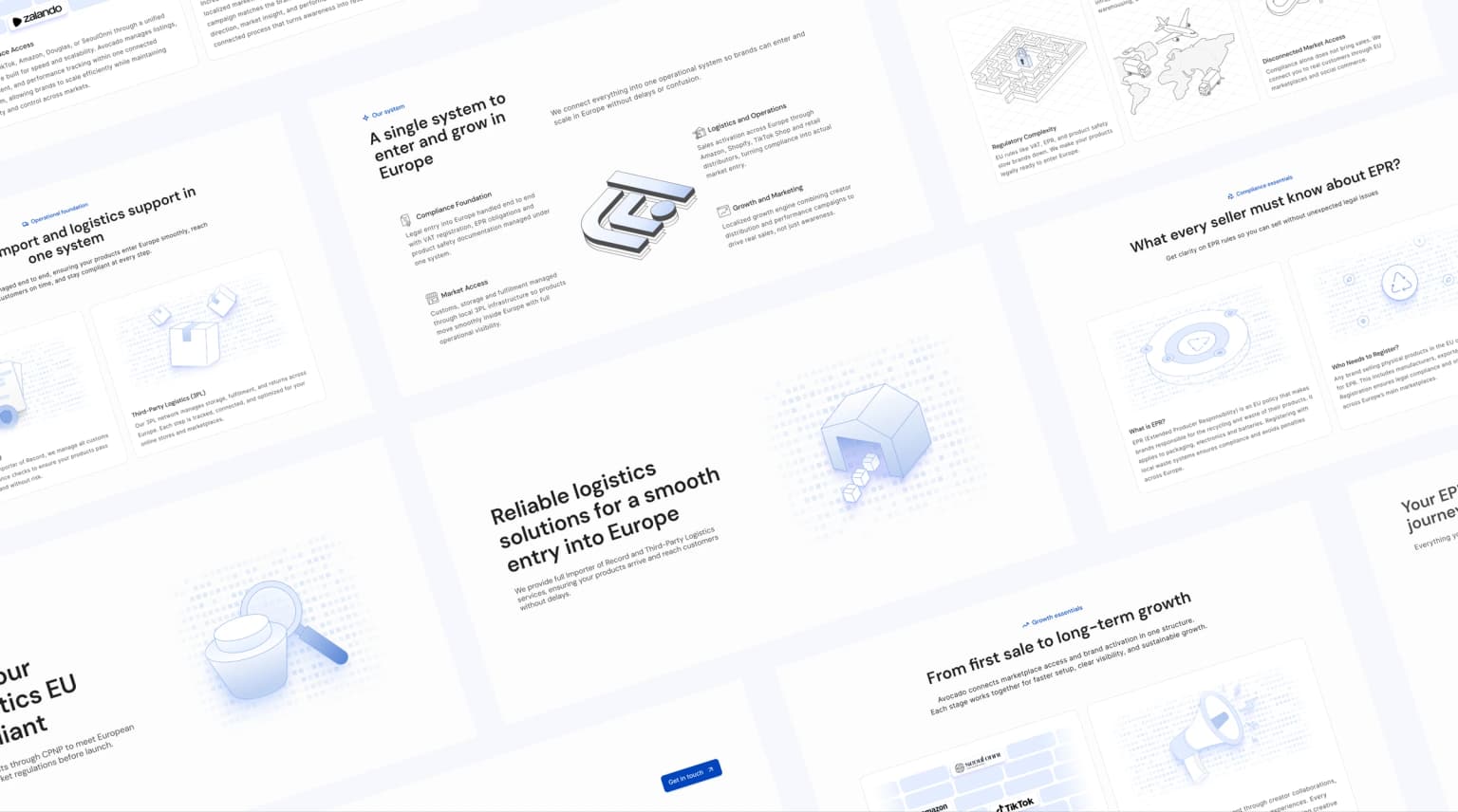
To avoid the heavy and outdated visuals commonly found in this industry I created a custom illustration direction. The goal was to support complex topics with simple, friendly and modern visuals. The illustration system was built around clean lines and simple shapes that match the brand's minimal visual style, a consistent rhythm that links all service pages, light and approachable elements that avoid the typical overwhelming style of compliance brands, and modular components that can be reused for marketing or educational materials.
Web Experience and Content Structure
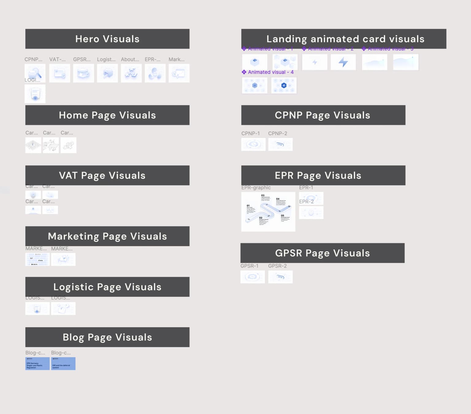
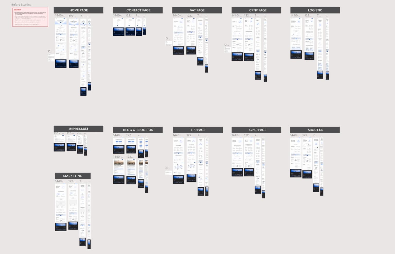
The main goal of the website was to explain the service journey in a clear and simple way. Each service received its own section with short and structured explanations. The hero area introduced the idea of an all in one solution. Content blocks were designed for quick scanning and easy reading. A clean grid and simple typography improved readability and strengthened the modern visual tone. In total I delivered a full website consisting of 11 pages. Each page was designed across 4 breakpoints to ensure a clear and consistent experience on desktop, tablet and mobile.
Results
- Built a professional and modern identity
- Showed all services as part of one complete solution
- Stood out in a market filled with outdated design patterns
- Improved clarity through structured content and simple messaging
- Gained a consistent visual system supported by a custom illustration library
- Presented a clean and focused website without distracting template elements